INCLUDE+D MARKETING WEBSITE
Responsive Web Design
A responsive web design for a marketing site that promotes the Include+d: Fashion for Every Body app through an inclusive web experience.

PROJECT OVERVIEW
A 1-week design of the development of a single-page responsive website as a continuation of my BrainStation Case Study project. Include+d marketing site is designed to communicate its product value proposition to its target demographic - persons of disabilities seeking apparel that suits their adaptive consideration.
Project Type: Case Study, Academic
Timeline: 1 Week
Role: UX/UI Designer, Branding
Artifacts: Branding, Sketches, Content Flow Diagramming, Wire-Frames and Prototype
Tools: Figma and Photoshop
Plaftform: Responsive Web
THE CAMPAIGN
Fashion for Every Body
Find apparel that works for your needs - whether that is adaptive fashion or inclusive design. We’ll help you save countless hours searching for products in your unique style.
TONE + AMBIENCE
BRANDING
Chique, Freedom + Inclusive
Expanding the visual identity previously established for Include+d, I developed my existing mood board further to evoke the goal of branding the website in a clean, cool tone and minimalist design making it easily digestible for users who might have sensory or cognitive considerations. To help curate the design I audited varying websites that demonstrated an editorial feel with a clear information hierarchy.
IDEATION
SKETCHES + WIRE-FRAMES
Mobile First: Value Proposition Designing
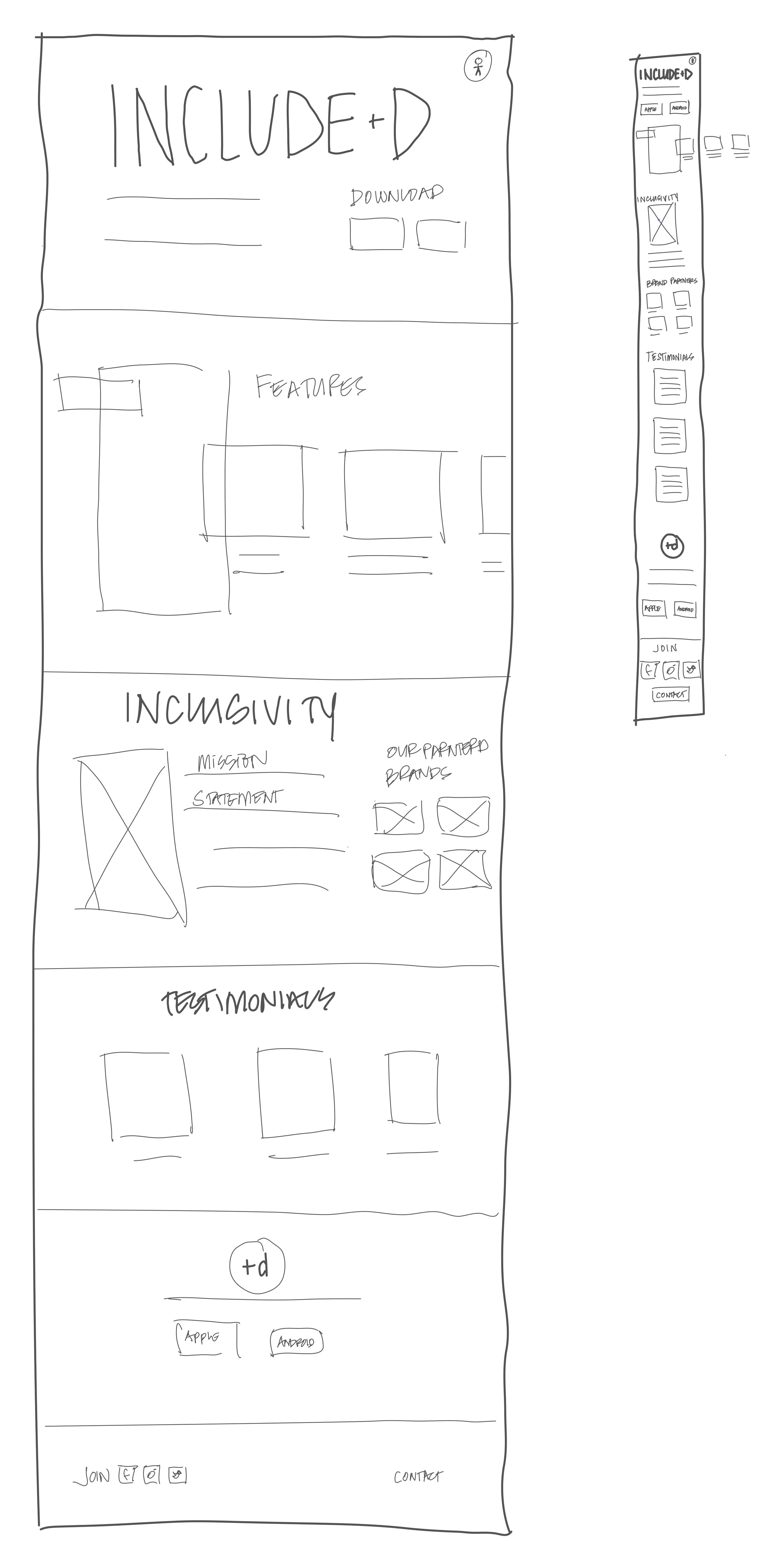
To explore quick iterations of Include+d responsive web layout, I used sketches to visualize how the information needed to convey the value proposition could be organized. Key elements such as user testimonials, app features and partnered brands.
Iterations two and three were explorations in re-arrange the key sections I wanted to highlight to attract users to download.
The solution sketch took parts from each iteration for a more refined design and digestible layout with clear sections defined.
SOLUTION SKETCH
MID-FI WIRE-FRAMES
Communicating the Blueprints
A grayscale digital translation of analogue sketches for Desktop and Mobile layouts in exploration with realistic sizing of the phone at a 1 to 1 scale. Body copy was added to help organize which features I wanted to highlight.
These were:
Adaptive Considerations
Ability to input style preferences
Inclusive reviews and the opportunity to leave direct feedback to the fashion brands
DESKTOP
MOBILE
MID-FI CONTENT FLOW DIAGRAM
Translating the Design
A Content Flow diagram was then developed to communicate how content will behave between desktop and mobile viewports. As well as providing the opportunity to expand upon how I wanted the information hierarchy to be ordered.
-
It was important for the first click on the site users would have an immediate attraction and understanding of the app and the opportunity to download it right away for those with short attention spans.
Key features followed suit with backup data to highlight the importance and proof of concept of the app.
Following suit were partnered brands and testimonials of how this app changed their lives and ending with a final CTA to download.
DESKTOP
MOBILE
PROTOTYPE
HIGH-FIDELITY DEVELOPMENT
Information + Colour Studies
The transition into high-fidelity involved quick colour injection studies, refining the copy, and sourcing mock-up assets.
These first two iterations really deviated from the integrity and aesthetic of the app with the minimalist, easily digestible and accessible design principles.
The last iteration was a quick study on the removal of colour but leaves room for further refinement with the opportunity for more visual legibility to highlight what makes this app so valuable for the target users.
A/B TESTING
Clear Communication
To help identify what is working and what doesn’t work for my target users, I conducted a quick A/B test with my educator and classmates on iterations V1 and V2. V3 shows the design changes implemented, but the final iteration was modified further based on additional feedback.
THE MVP
Fashion for Every Body
Find apparel that works for your needs - whether that is adaptive fashion or inclusive design. We’ll help you save countless hours searching for products in your unique style.
KEY LEARNINGS
-

DESIGN CONSIDERATIONS
It was a challenge to design an enticing marketing sight without overwhelming the target users with colour and flashy features.
It was important to keep in mind who my target audience is and the narrative in place while keeping accessible design considerations at the forefront of the design.
-

ACCESSIBILITY
The final design of the marketing site and the mobile design could not have too much of a sensory overload, the information needed to be easily digestible and the content layout needed to follow a uniform flow versus too much staggering information.
-

NEXT STEPS
There is an opportunity to take the branding and marketing further to really advocate the intention of the app and how it could become a foundation for inclusive design standards - like B-Corp Certification but for inclusive fashion.
EXPLORE OTHER PROJECTS
Include+d
Include+d is an iOS app that enables persons with disabilities to find apparel and products that match their preferred style with any adaptive considerations they might require.


